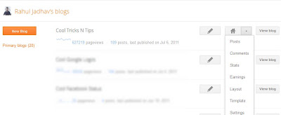
In March, the Blogger team had released a video displaying the New Blogger User Interface. Now they have introduced the New Blogger Dashboard to the Blogger Draft users. This means very soon they will introduce the new dashboard to all the uses. We feel that the launch will coincide with the public launch of Google+. Also there is news that Google is going to rename Blogger as Google Blogs. This redesign may accompany the name change.
The design of the new blogger dashboard is better than the earlier dashboard and it is very smooth to use. The new blogger dashboard has a minimal design and there is an individual dashboard for every blogspot blog that you have created on Blogger. When you view the blogger dashboard, you will see a list of all the blogs that you have created along with stats like the number of pageviews for the blog, total number of posts and the date when the last post was published. There is a button for creating a new post, going to the blog dashboard and also a dropdown button to go to the different sections of your blog like posts, comments, stats etc.
When you move the mouse over the blog name, you will see a downward facing arrow. If you click on the arrow, the particular blog will be moved from Primary blogs list to another list named Other blogs. So this is a good feature as we sometimes create blogs for testing purposes and its better to add them to another list.
When you click on a blog, you can see the dashboard for that particular blog. I liked the new dashboard for individual blogs as it quickly shows information about the blog like its pageviews, the number of comments, traffic sources. Earlier there was a horizontal menu that contained the various sections of the blog. Now that menu has been replaced by a left sidebar.
Apart from the usual options, there is a new section called Earnings. When we tried to check it, we saw the Coming Soon message. We hope that they put together a great feature.
There have been huge changes in the blogger post editor. Now there is a simple box for typing the posts in the center and rest of the options are either on top of it or in the right sidebar.
Earlier, the post settings and other options like labels were at the bottom of the post. Now, these options have been shifted to the right sidebar and it looks beautiful. When you click on the Labels option, you can see all the labels that you have used on your blog. You can select any of them or create a new one. The other options are Schedule, Location and Options.
These are the new features in the new blogger dashboard. There are many other minor features which you can check by visiting Blogger In Draft instead of the normal Blogger page. We hope that the blogger team graduates this new blogger dashboard design very soon.
Home » Tips Tricks » Google Redesigns Blogger Dashboard
Google Redesigns Blogger Dashboard
Posted by Muslim on Friday, July 29, 2011
Labels:
Internet,
Tips Tricks


{ 0 comments... read them below or add one }
Post a Comment