Showing posts with label Internet. Show all posts

Easy Ways to Improve Your Website

Posted by Muslim on Tuesday, August 30, 2011

Here then are ten more tweaks (presented as problems and fixes), bringing the total to twenty. Hope they’ll keep you busy for a while. 


  1. Key Content Hidden “Below the Fold” - You have seconds to capture a visitor’s attention. If visitors need to scroll down to view vital content, you’ll most likely lose them. Similarly, if you have an important widget, such as a Facebook fan page widget, place it where it will be visible without scrolling down.

  2. Long Flash Intro - I hate sitting through flash intros designed to impress. Don’t you? Why would you want to subject your visitors to long (or even short) flash intros? Flash intros are dead time. Why not instead impress visitors with your knowledge and the relevance of your content?

  3. Clutter - Some websites have too much going on; they look like patch quilts. Others have ads that fill every nook and cranny. What can I say? Such sites are overwhelming.

  4. No Call to Action - What do you want your visitors to do when they visit your site? To buy? To subscribe? To leave a blog comment? Let them know what you expect, and if your request is reasonable, they may very well comply. If you don’t ask, they may not know what to do, and they’ll leave, perhaps forever, without taking action.

  5. Distracting Ads - Pop-up ads, blinking ads, glaring banners, sexy ads, scripts that forward to advertisers’ sites after a few seconds, inappropriate auto-playing audio, etc. I dare say, these are “the thousand natural shocks that flesh is heir to.” Make sure your ads don’t interfere with your content. If your ads are your content, then please disregard everything you’ve ever read on this blog.

  6. Images Not Labeled - Make your visitors and the search engines happy. Whenever possible, describe your images using alt and title parameters in your img tags. If all this is gibberish to you, worry not. Your web development or HTML guru will know what to do.

  7. Hard to Navigate Site - Don’t confuse your visitors. Keep your website simple and provide a site map if you can.

  8. Difficult to Understand - Write for your audience. Not everyone will have an advanced degree, some could have nothing or as little as a certificate from an online school – unless of course such people are your target audience.

  9. Spelling and Grammar Mistakes - There ain’t no excuse for bad spellin and grammar.

  10. Stale Content - Fresh content is good for SEO and for attracting repeat visitors. 


Please subscribe, leave a comment, follow this blog and share this article with your friends and colleagues.
More aboutEasy Ways to Improve Your Website

Focus Your Website or Blog for Better SEO

Posted by Muslim

You’re creating content for your blog or website. You can create content haphazardly, or you can laser focus your web content to advance your site in the search engines. 


A website consists of one or more web pages. Search engines index web pages individually. 


For each keyword phrase that you care about, create a web page on your site dedicated to that keyword phrase alone. 


Your Keywords Don’t All Need to be Popular 


For example, your company name is probably a low volume search term, but it’s meaningful to you, all the same. It’s you who decides which keyword phrases deserve focus and assign each of those phrases its own page, either a static page or a blog post. 


Real Time Web AnalyticsIf your website has been online for a while and you notice from your web analytics that certain pages are already receiving substantial traffic for certain keyword phrases, then those pages are evidently already focused on their associated keywords. 


Throughout your site, link occurrences of your keyword phrases to their associated web pages, thereby helping those pages gain authority and climb the ranks of the search engines. When generating external links into your site, make a keyword phrase your anchor text and link to that keyword’s special page. 


Edit Previously Published Blog Posts 


Don’t hesitate to edit your previously published blog posts. If they’re your pivotal keyword pages, try hard to enhance them. However, review all your pages and update their links in order to sharpen your site’s keyword focus. 


Stick with it, since search engine optimization takes time. However, with consistent effort, you’ll dominate the search engines one keyword phrase at a time. 
Please subscribe, leave a comment, follow this blog and share this article with your friends and colleagues
More aboutFocus Your Website or Blog for Better SEO

Preserving the Ecological Balance Inside Your Mouth

Posted by Muslim on Friday, August 19, 2011

We all know the importance of clean air, fresh, wholesome food and pure water, the three most important things in life!  But do we realize that the QUALITY of our air, food and water is what matters most?  And if we do recognize that quality is essential do we know why?  Do we understand at a molecular level what oxygen, hydrogen, carbon and other elements are actually doing, needed and in what amounts?  And when we do know, are we aware of how to use them to maximize health and minimize disease?  This is the essence of biology, chemistry and LIFESTYLE MEDICINE!  Using simple but essential elements in our life, to increase our health, performance and longevity!  So simple, yet so complex and so misunderstood!

Unless you’re prepared to go back to school or devote most of your days researching you probably need a team of healthcare professionals who can do the research for you!  The  essence of biological dentistry, naturopathic nutrition, energy and informational medicine and functional lab testing is simply understanding how to assemble natural ingredients in a way that maximizes health and wellness!

One of the most important aspects of a LIFESTYLE MEDICINE program involves regular, and medically supervised detoxification.


Among the many methods that can be used to initiate the gentle removal of toxic poisons that accumulate in the body and contribute to disease, degeneration, and ageing in addition to physical removal of teeth and mercury are:

  • OXYGEN and OZONE THERAPY

  • Bio-Resonance Quantum Biofeedback

  • Chelation Therapies, IV versus  oral Supplements

  • Detox Soaks, Clay or mud baths, wraps or packs

  • Colonics and Enemas

  • Juicing and cleansing diets

  • Homeopathic drainage

  • Herbal detox , Detox Foot Pads and Ionic foot baths

  • Alkaline water machines and Fasting

  • Near and Far Infrared Sauna


OZONE is the naturally occurring elemental form of oxygen that forms in response to ultraviolet energy or in the presence of lightning.  It is the result of a temporary repatterning of oxygen atoms into groups of three.  Ozone generators simulate lightning using an electrical discharge field.  Ozone has a protective influence on the earth and all life forms on the earth , from single celled amoebas to complex human forms.  Ozone absorbs harmful ultraviolet rays from the sun in order for life forms to survive the scorching rays and harmful electromagnetic emissions in our atmosphere.  Ozone forms at ground level as a result of the reaction between these ultraviolet lightwaves and the hydrocarbons, nitrogen-oxide and sulfur compounds produced in industry and the process of living.  Ozone helps clean the air so we can safely consume the oxygen in the atmosphere!  Without ozone, anaerobic microbes would literally destroy the ecosystem and create an environment in which you and I could not survive.

Ozone is a powerful oxidizer making it highly effective in the control of bacteria, fungi, viruses and parasites inside and outside the human body.  The goal of any biological system is ecological balance, and in this instance the battle  between microbial populations and all other kingdoms that share planet earth.  Ecology is essential to life and health inside and outside the body and ozone occurs naturally to help preserve this ecological balance and ensure the procreation of life.

Medical grade oxygen has been used effectively for many years in conventional medical practices.  Today, the use of medical grade ozone is being recognized as equally as effective in the control of microbial populations in the mouth.    Because of ozone’s physical properties, with the ratio of ozone to oxygen being extremely low, it can easily be directed with precision to effectively regulate bacterial, fungal and parasitic infections in, around and in between teeth and gum pockets around the teeth or on the tongue.

Oral infections are a continual battle in both soft and hard tissues of the mouth.  Infections stem from single organisms or combinations of many.  In the early stages of dental work it’s essential to identify and control infections at both the focal and the systemic level in order to have a successful outcome.  Acute and long standing chronic infections of any kind can interfere with the success of healing.  An infection anywhere in the body impacts the immune system and if overlooked can be the primary cause of poor wound healing, recurring cavities, gum disease, failed implants and reinfection of the afflicted tissues or teeth.


Oxygen and its energized form, ozone, weakens and penetrates the protective membrane surrounding microbial colonies inside the mouth where organisms sequester to avoid annihilation by the immune system.  Ozone exposes the contents of pathogenic colonies to both the immunologic system and highly concentrated oxygen so they can effectively be eliminated.  One of the most amazing biochemical and physiological studies conducted at Scripps Institute recently showed how antibodies actually produce ozone to protect themselves from invading microorganisms.  When these biofilms are perforated the bacteria can no longer hide from circulating antibodies that attach to identification pathogens and they are exposed to the deadly ozone.

In reality, we are now duplicating nature’s work within our dental standard of care.  By integrating alternative and holistic therapies into dentistry, we can combine sound, evidence-based science with natural methods.  The therapeutic goals of LIFESTYLE MEDICINE are inclusive rather than exclusive of standard of care and include:

  • Elimination of pathogens

  • Restoration of proper oxygen metabolism

  • Induction of a friendly ecological environment

  • Increased circulation and flow of energy

  • Immune activation and

  • Stimulation of the humoral anti-oxidant system.


OZONE THERAPY is an exciting method of naturally preserving the ecology of the mouth, gums, teeth and entire oral cavity and it’s now available in Temecula, as part of the holistic services offered through biological dentistry and LIFESTYLE MEDICINE.  We will continue to provide you with informative articles that combine innovative natural methods for regeneration and detoxification of the body, mind and environment!

Adding oxygen/ozone therapy in dentistry offers a multiplicity of protocols to deal with dental infection in order to optimize results and ensure positive outcomes for the patient.   By working in ALLIANCE with seasoned professionals the patient can enjoy comprehensive care for the whole body, mind and even their environment.  Please watch for our next article about combining the use of bio-resonance and quantum biofeedback to identify where stress is held in the teeth, gums and acupuncture meridians that connect the teeth to the entire body and discover how you can integrated this effective method into your own lifestyle to optimize detoxification and improve systemic healing.
More aboutPreserving the Ecological Balance Inside Your Mouth

Internet Survival Tips for Kids and Teens

Posted by Muslim on Wednesday, August 10, 2011


  1. Never give any personal information to anyone you meet online. That means first or last names, phone numbers (they can be used to track down you home), passwords, birth dates or years, or credit card information.


  2. Never meet up with anyone you don't already know. Don't tell anyone your schedule; don't say where you'll be hanging out. No party announcements. People are often not who they say they are. It's true: 1 in 5 kids will be sexually solicited online.


  3. Don't fill out any "fun" questionnaires that are forwarded to you, even if they're from your friends. Remember, you're in a world where everything can get forwarded. All those personal things about you could land in the hands of someone who could use them to harm you.


  4. Make sure you know everyone on your buddy list. If you haven't met the people face-to-face, they may not be who they pretend to be. Also, Instant Messaging strangers is an invasion of their privacy.


  5. You do not have to answer emails or IMs from people you don't know. As a matter of fact, you shouldn't. Who knows who they are? Even if they say they're "David's friend," David could be a lucky guess. "Kids" you meet in chat rooms may actually be creepy adults.


  6. There's no such thing as "private" on the Internet. You may think so, but it's not true. People can find anything they want — and keep what you post — forever.


  7. Be careful about posting pictures of yourself (if you must, don't post sexy ones or ones showing behavior you wouldn't want your mom, teacher, boss, or potential college advisor to see). Just because an older sibling has posted snaps on a site doesn't make it a smart or a safe idea. Pictures with identifiers like where you go to school can be shopping lists for online predators and other creeps.


  8. Don't send pictures of other people. Forwarding an embarrassing picture of someone else is a form of bullying. How would you like it if someone did that to you?


  9. Don't download content without your parents' permission. Many sites have spyware that will damage your computer. Other sites have really inappropriate content. Your parents can check your computer's URL history, so you can't hide where you've been.


  10. Never share your password with anyone but your parents.

More aboutInternet Survival Tips for Kids and Teens

POTTERMORE (about J. K. Rowling's Next Project)

Posted by Muslim on Sunday, August 7, 2011

The Pottermore Insider has posted a new blog entry answering a number of questions from readers of fan sites across the internet about J. K. Rowling's Pottermore.  The post reads:

Potter fan sites from around the globe helped us with the Pottermore name reveal, and now those same fan sites have been kind enough to tell us what their readers most want to know about the Pottermore experience. 
 
While we can’t give everything away (even though we know you’d like us to!), we’d really love to answer some of your questions... 
 
Will Pottermore be available in multiple languages?

Yes. Initially, Pottermore will be available in English, French, German, Italian and Spanish. We are aiming to introduce more languages in the future – including Japanese and Korean later this year. You’ll be able to keep track of language availability here on the Insider
 
Will Pottermore be free?

Yes, access to Pottermore will be completely free; you won’t have to pay anything to use the site. The Pottermore Shop will have items in it that you’ll be able to buy, but choosing to purchase something – or not – won't affect your progress through the story as the Shop sits outside of the online reading experience. 
 
Can you please explain what you mean by 'online reading experience?' How much will I, as a
Pottermore user, be able to affect the story? After all, hasn't Harry's story already been told?
The best way to think of Pottermore is as an interactive, illustrated companion to the books. J.K. Rowling wanted to create a site where her stories could live on and where readers could explore them in a new way. In addition to discovering new material from J.K. Rowling about Harry’s world, you’ll be able to interact with key story Moments (the Sorting Hat sequence, for example) and upload your own comments, thoughts and artwork for all the characters, objects and places that you come across. 
 
So Pottermore isn't a massively multiplayer online role-playing game like World of Warcraft, or a social network game like Farmville?

No. While there will be some simple games you can play (you'll be able to brew potions, for example), Pottermore is very much about the books: being able to experience Harry’s story in a new way and discover all the additional information that J.K. Rowling has written. 
 
Isn't there a House Cup that we compete for by earning points?

Yes, there is. As you progress through the story you'll also be able to earn house points – and once you get to the end of the first book you can carry on earning points to help your house win the House Cup. 
 
Would you say Pottermore is a social network for fans of Harry Potter?

Not really. Pottermore isn’t trying to compete with sites like Facebook or the Harry Potter forums and fan sites that are already out there. Once you’ve signed up to Pottermore you’ll be able to find and invite your Facebook friends (if you're over thirteen) and leave comments in your house common room and the Great Hall, but Pottermore isn't a social networking site where you can share personal information or chat in forums. 
 
I saw the Sony logo at the top of Pottermore.com. What's Sony's involvement with the site?

Sony is the primary partner of Pottermore. They have been consulted and involved in the development of the site experience and will offer a range of products and services to Pottermore users. 
 
Is Pottermore the Harry Potter encyclopedia?

J.K. Rowling has written exclusive new material especially for Pottermore giving unique insights, back stories and additional information about the characters, places and objects in the Harry Potter series. For now, Pottermore is the only place you’ll be able to find new information from J.K. Rowling about Harry’s world, and we'll be releasing this material as each of the seven books appears on the site. 
 
Once I've been sorted, will I be able to change houses?

J.K. Rowling has created a series of questions for the Sorting Hat, and how you answer these questions will determine which of the four houses you’ll be in. Once you've been sorted, you won't be able to change; the Sorting Hat's decision is final! 
 
What formats will the ebooks be available in? Will I be able to read them on my iPad/Sony eReader/Kindle...?

The Pottermore Shop is due to open in October. Our aim is to offer the ebooks in an as many formats as possible. We’ll provide more information closer to the time. 
 
I’ve submitted my email to the Pottermore website – does this mean I’m registered with Pottermore.com?

Not yet. If you’ve submitted your email address to the site, we'll use it to let you know when site registration is open to everyone. In other words, once you’ve received an email from us, you'll be able to visit Pottermore.com and complete the registration process. 
 
What's going to happen on 31 July?

We don't want to ruin the surprise but something will be happening on Pottermore.com on 31 July. Come back to the site, or keep an eye on the Pottermore Insider (http://insider.pottermore.com) and our Pottermore Twitter feed for details. 
 
Is the Pottermore Owl Twitter account official?

No, it's not – but we kind of wish we'd thought of it !

source :www.the-leaky-cauldron.org
More aboutPOTTERMORE (about J. K. Rowling's Next Project)

Guestbook Etiquette

Posted by Muslim on Sunday, July 31, 2011

One cool activity to engage in as you surf the web is guestbook signing. Look at it this way, you are examining a site anyway, checking out what it has to offer. Perhaps it's a Star Trek fan site, a WWF site or a person showing off her Barbie Doll collection. The point is you've spent some time there and presumably you've gained some enjoyment, knowledge or at least idled away some time.

So why not take an extra two or five minutes and sign the site's guestbook? Remember, there is a person or two behind every website, and they have feelings. It's always great to get an entry from someone who gained something, however small, from the hard work that has been put in.

A good guestbook entry has, in my opinion, a few simple elements. First, when I sign a guestbook I always thank the person for his efforts and for taking the time to put together the site. I also try to point out something (anything) that I liked about the site and why. Just a couple of sentences saying something like "thanks for creating your stationary site! My wife and I will be using some of your stationary in our emails from here on out! The horse background was especially well done."

I also include a graphic logo if the guestbook accepts HTML (most do) with a link back to my site. That way the webmaster can return the favor if desired, but it's not a blatant advertisement.

One thing I really hate is someone who just leaves an advertisement in my guestbook. Look, at least tell me you like my site. At least thank me for the effort. Don't just put a big 'ole ad or banner with nothing else. There is a word for this ... it's called SPAM.

Rude comments should also be avoided. I mean, if you really do want to deliver some criticism to the webmaster, please do it privately in a one-to-one email. There is no need to tell someone he messed up the navigation in public to the whole world --- and a guestbook is public.

So please, take a few minutes to sign guestbooks as you surf the web. You will make some webmasters very happy.


source : internettipsandsecrets.com
More aboutGuestbook Etiquette

Hacker Notes: War Dialer

Posted by Muslim


If you've seen the movie War Games, you've seen a primitive war dialer at work. Remember the scene where the kid sets up a modem to dial all of the phone numbers within a certain prefix? He's looking for computers, and he can tell because when you dial a modem it answers with a distinctive series of sounds. War dialers are generally available as freeware on hacker sites, although as the proliferation of the internet has grown their usage as fallen.

The war dialer in War Games is not very sophisticated as it only finds phone numbers which are suspected to be computer dial-in lines. A more aggressive version might actually attempt to determine the operating system, and a very aggressive version might attempt to perform some automated break-in attempts itself. It would do this by throwing some standard usernames and passwords at each phone line that it discovered.So how does a company protect itself from war dialers? There are several things that can be done, and depending upon your budget and level of exposure you may want to do most or all of them.

One task is to set up your dial in modems to just those protocols and speeds that your users will actually use. Most modems negotiate with their dial in partners to determine how to communicate. This allows anyone with any type of modem to connect. If you restrict your dial in modem to just those speeds and protocols you actually use, then you lock out at least a few potential intruders.

Another thing you will need to do is ensure that nothing about your system is revealed to users who have not yet logged in. You see, sometimes a system will prompt dialup users with something like "Red Hat Linux 7.1..." which immediately tells intruders what operating system you are running. This means the potential intruder knows which set of break-in tools to use without even trying anything yet. If he does not know which operating system you are running, he will be forced to work harder to gain entry.

You can also get secure modems for all of your users as well as the dialup line. This means the two modems (the one answering and the one calling) must validate on a hardware level and would lock out all but the top level hackers and crackers. This is relatively expensive, however, as the security must be in place on all dial in users.

One of the very best defenses is something called Call Back. What this means is the operating system has an associated phone number with each username. When the user dials up the modem and logs in, the phone hangs up and calls back a pre-determined phone number. This is great for users who work off site from a single location, but it does not work well for users which move around from place to place.

Of course, you should keep firm control over the attributes of accounts which are allowed dial in access. First, check over your list of accounts to be sure only those that actually need dial in access have it. Second, force the highest level of security (frequent password changes, complex passwords and so on) on those accounts.

Some operating systems allow a second password for people who dial in. This makes intruders work extra hard, as they must crack two passwords instead of just one.

Finally, you must log all dial in attempts (especially failed attempts) and investigate them quickly and thoroughly.

One of the biggest challenges facing a network security person is that many of the modems connected to a network are undocumented or even unauthorized. It's difficult to monitor something that is unknown. Countering this problem requires a company policy with teeth (i.e., termination of anyone found to have installed a modem without notifying the appropriate people) and regular network security audits.
More aboutHacker Notes: War Dialer

Who Needs a Domain Name?

Posted by Muslim on Saturday, July 30, 2011


So you say you've got a web site. Congratulations. Okay, what have you got? A few pages linked together, some graphics, perhaps a few sound files and, of course, the ever present banners. You're proud because you've done a good job - the best that you know to do.


Guess what? You're not done yet. You want the site to not only look professional ... you want to to BE professional. Check your list: Loads fast, yep. Looks clean, yep. Good content, yep. Lots of interactive features like guestbooks and forms, yep. What could be missing?


Could it be that your site URL is something like (this is made up):

"http://www.geocities.com/athens/1040/"

But wait a minute ... that's a perfectly good URL, isn't it?

Yes, it is, but this is not a professional URL. A URL like this (or any number of other similar ones) is a sure sign that you have not yet risen above amateur. In fact, it does not matter how good your site is ... if you do not have your own domain (a custom URL which you "lease" for a period of time) you are considered an amateur and your site will be viewed as such.

Getting your own domain name is not expensive by any means (this is called registering a domain). I believe that the highest you should pay is on the order of $35 a year and you can do much better. Some hosts will charge a small fee (anywhere from $10 to $100) for the convenience of doing it from their own site. My advice is to find a host that will register the domain name for free (you still pay for the domain but not for the service from the host) ... most will.

There are dozens, if not hundreds, of places on the web to register your domain name. Personally, I prefer good old Network Solutions, although they are slightly more expensive than most. Since the fee is so incredibly small for a single domain (the equivalent of a couple of large pizzas), I would stick with them unless I needed dozens or hundreds of names.

What kind of name should you get? Something that reflects the theme of your site. If it's about chocolate then choose something along that line ... perhaps i-love-chocolate.com or chocolate-lover.net. Notice that you can include dashes if you want (no spaces, though). You can also use ".net", ".org", and ".com", or a host of other top-level domains (that's what those characters after the final dot are called). If you really want, you can even use a foreign top-level domain such as ".to" (Tonga, an island in the Pacific) or ".uk" for United Kingdom (you have to find a company other than Network Solutions for that, however).

You can also choose a long domain name if you want. Some people say this is important because you want to include a few keywords (specific terms related to your site's contents) in the domain name. Thus, if your site was about making money, you might get "making-money-get-rich-dollars.com". The theory is that the search engines use these keywords to list your site higher ... meaning you get more visitors.

But wait a minute, you have a site on, say, Bizland.com called "mysite.bizland.com" and you want a domain named "i-collect-madonna-videos.net". How do you relate the two?

That's handled when you create the domain (or transfer it, which means changing it from one host to another). You simply indicate that any references to the domain name are to be directed to the address that you specify. The magic of the internet naming system takes care of the rest.

There's a little bit more to it, though, if you want to get more complicated. When you lease a domain name you also lease a few other components. One of the most useful items is email ... you can have access to the email server address.

What does this buy you? Well, for example, I've got "internet-tips.net" as my domain name. My host also handles emails that go to that domain by forwarding them wherever I want. This, I can create "richlowe@internet-tips.net" and "iwanttobuy@internet-tips.net" and anything else that I need. I've got access to EVERY single name that I can think of in front of the "internet-tips.net". This is great for determining where an email came from (each ad can use it's own email address, for example, allowing me to track effectiveness of an ad).

In addition, you can set up an account with a place like "bigmailbox.com". What these guys will do for you is let you give out email accounts to other people. This is a great service to offer to people who visit your web site. Many people can use a free email account, and if your domain name is creative it can be very popular. Imagine something like "tom@klingon.com" or "suzie@i-am-gorgeous.net".

I've found one of the most important advantages of having my own domain names is that they are very simple to transfer. Let's say you do have that Geocities site and you've bought "i-love-chocolate.to". Now you move to a better host, say addr.com. Just move your site, transfer the domain and viola, you are set (note: this does take a few days or occasionally weeks).

The beauty? Make sure that all references in your site are to the domain name. That way all of the references still work and you don't have to change any web pages at all.

As you can see, there are many reasons to get your own domain. If you really want to have a good looking, professional site, then perhaps you should get one today.


More aboutWho Needs a Domain Name?

Brief web Design Tips

Posted by Muslim

Here is a list of some tips to help you with your web pages. These are simply suggestions to help you create a better surfing experience for your visitors.
Avoid Under Construction signs - All good web sites should always be under construction. Including the words "under construction", or worse yet a blinking animation, only makes you look like an amateur. These notices are so frowned upon that directories such as Yahoo will not accept sites with one on the home page. Most awards programs will immediately reject any sites displaying this dishonorable phrase.
Don't use a hundred different fonts on the same page - You can run into all kinds of problems when you use fonts on the internet. There are incompatibilities between operating systems (Unix, Mac and Windows all work differently) and browsers. Fonts have to be installed locally by your visitor - if he doesn't have it installed your page may look funny to him.
If you mix many different fonts on your page you are almost immediately known as an amateur. A font or two is fine, but work to avoid the "ransom note" effect.
Don't write your HTML to a particular browser - Browsers change very quickly. The one that is popular today may be almost unused in a few months. So don't spend any time trying to fit your HTML to Internet Explorer or Netscape or Opera. Just make good HTML and then let the browser do it's job.
Use style sheets - Style sheets (known as CSS) is a way to gain incredible control over how items are displayed on your pages. Better still, you can create one style sheet document and reference it from all over your web. This way, if you want to change, say, your text color from green to blue, you only have to change one file. Every reference to the style will automatically and immediately get changed.
Include Meta Tags - Meta tags are used to tell the outside world, especially search engines, all about your pages. You should include the appropriate meta tags on each and every page. These tags need to give a description, copyright notice, author name, language and search keywords. In addition, it is a good idea to include the RSAC rating for content filters.
Include a descriptive title - Be sure and write a short, keyword heavy, very descriptive title for each page. Search engines rely on these titles in determining how to index your site. Be sure your title is accurate and honest as well.
Avoid lots of moving things - An occasional animation is great and can turn a boring page into an award winner, but don't go overboard. In general, more than one animation per page is excessive.
Don't change your visitors settings - Don't change the browser controls, the window size or the cursor. Many surfers (myself included) get very annoyed when these things are changed - and annoyed web surfers tend to never come back. Two of the worst offenses: changing the back function to do something other than go back to the previous page and disabling the right click.
Remember not everyone is from your country - This is called the world side web, and you must remember that your document will be read by people all over the planet (and maybe even from outer space!)
- Be sure your dates make sense. For example, 01/02/01 means January 2, 2001 in the United States but February 1, 2001 in many European countries. I prefer dates in the format 1 January 2001, although you may also write 2001-01-02 (year, month and day).
- If you write a time, be sure and indicate the time zone.
- Be sure and include your area code on the phone number, and specify which country if appropriate.
Include height and width on images - This allows the browser to "pre-allocate" the space for the graphic on the display, which makes it all look better. In addition, if ALT tags are included with the images, then something will display even if the image is not.
Include ALT tags on all graphics - By including an ALT tag on graphics, you ensure that your page will look good even if your visitors surf with images disabled.
Include a contact method - Web sites are created by human beings, and web surfers appreciate knowing they can communicate with someone. Some webmasters like to include a "mailto" link on every page. I prefer using a link to an email form so my email address is not harvested by spam robots. Whatever method you use is fine, as long as visitors have a way of reaching you.
Check your pages - Once you've finished a page, be sure and test it. Check each link to be sure it actually goes somewhere. It is also a good idea to check each page in the major browsers - Netscape, Internet Explorer and Opera. The pages will not always look the same, but you should at least make sure they look decent.
Make your pages consistent - Your navigation and layouts should be consistent from page to page. Your visitors will then know what to expect as they surf through your site.
Keep your colors sane - A pink background with bright florescent green letters is probably not the best way to win friends. Use all of the colors you want, but it's best not to make your pages resemble an LSD nightmare.
Keep down the page size - Remember most surfers are still using dialup connections. Thus, you need to keep your pages small (including graphics). Thirty to fifty kbytes per page is about the right size.
Don't use ActiveX controls - Personally, I will immediately leave a site which asks me to download an ActiveX control. Why? Because ActiveX depends upon the surfer trusting the person who created the control. How would I know if this thing is safe? I prefer the Java security scheme, which is much better defined and safer (in my humble opinion).
Don't use popup advertisements - You really want to annoy your visitors? Popup advertisements are a good way to get people really unhappy. It's a good idea to never throw an ad up in front of your visitors - that is, if you want them to come back.
More aboutBrief web Design Tips

Black Hole Lists

Posted by Muslim

When you send an email across the internet, you must first log into your ISP's email system. Generally, you set the login information (username and password) in some setup screen, then quickly forget about it. However, behind the scenes your username and password are used to log in each and every time you send email.
When the email system receives your message it opens a connection to the recipient email system and delivers the message. This is the way email normally works, at least on properly configured email systems.
Unfortunately, many emails systems are not properly configured (or have older, buggy software). These systems have become the bane of the internet and are one of the primary reasons that spam is so hard to fight.
These email servers are known as open relays. You see, email systems also have the ability to send messages to one another. This is known as relaying. In the good old days of the internet, back when it was a small network of universities and military installations, spam was not a significant issue. During those innocent times, there was little security because there were not many offenders. Thus, email systems did not protect themselves very well.
What is there to protect against? Spammers use open relay systems to hide their identity. What happens is simple. A spammer sends messages using one of these open relay systems and bypasses the normal security. The spammer is basically hijacking the email server to do his dirty work for him.
You see, email messages are actually enclosed in an electronic envelope which identifies where the message came from. So if a spammer sends a message through his own ISP's email server, then it could be tracked back to him because he has an account on that server.
However, if he hijacks an open relay, he can send all of the messages that he wants without worrying about being tracked. The email message identifies the open relay as the system where the email came from; however, the spammer is not a legitimate user. The open relay does not (unless it goes to great lengths) have a clue where the messages came from.
A spammer must rub his hands together in glee when he finds one of these systems. I can just imagine the evil laugh as the spammer presses the return key to send literally hundreds of thousands or even millions of messages through the open relay system. 
This cannot happen on a properly configured, secured and patched email server. 
Open relays are a big problem, and to combat that problem a number of services have appeared. These are called Blackhole Lists, and what they do is simply list all of the open relays that they know about. ISPs and others can subscribe to these lists and use them to block email messages.
Here's the process. A system is determined to be an open relay. It is added to one or more Blackhole lists. ISPs that subscribe to the lists will bounce (return to sender) any messages that originate from the open relay email system. This means ALL users from that email system are blocked. Every single one of them.
I know that seems cruel, but look at it this way. The open relay is encouraging spammers and is an unwitting accomplice in their operations. In fact, many of these open relays do not even know they are causing a problem, and the first inkling that they get is when their users complain that things are running slowly or when problems occur with their servers.
The Blackhole lists are often run by individuals or small groups who believe in the anti-spam cause. They are often unpaid volunteers who simply want to help clean up the internet. They are also extraordinarily successful and many ISPs use their services.
To give you an idea of how successful this approach has been, there was a blackhole list called ORBZ. This was run by a young man named Ian Gulliver, a 20-year-old systems administrator from Ghent, New York. Ian is an extraordinary person and created one of the most successful blackhole lists ever.
What ORBZ did is send messages to email systems to determine if they were open relays. If it determined that the email system had this problem it added it to it's list. This was very successful until the end of March, 2002.
At that time, ORBZ probed the email server of Battle Creek, MI. Unfortunately, this system used the Lotus email system, which has a known bug. The probe caused the email server to slow down considerably, and it was interpreted by the city as a hacker attack.
The poor ORBZ administrator found himself the subject of a search warrant signed by a Michigan judge that authorized the search and seizure of all data relating to ORBZ accounts.
Ian almost immediately shut down the ORBZ system (he reopened the service a few days later with some major changes and a new name), which led directly to a huge amount of spam suddenly being received all over the internet. The closure of a single blackhole list had dramatic and noticeable results.
The upside is that blackhole lists prevent a tremendous amount of spam from getting sent throughout the internet. They are very efficient and the concept is simple and straightforward.
On the downside, blackhole lists are not governed by anyone and answer to no one. They add open relays (and other spam sources) to their lists using their own rules, and usually assume the suspected spammer is guilty until proven innocent. 
They are, however, a necessary and vital piece in the war against spam.
More aboutBlack Hole Lists

Internet is Dangerous Environment for Children

Posted by Muslim

The internet is a dangerous place for your children. Don't even begin to believe that your child is safe. There are more dangers than you can possibly imagine waiting to lure children to their doom. You had better be aware of what's happening and take steps to shield them from the danger ... if you don't, your child's sanity and safety are at serious risk.

Does this sound alarmist? Actually, I cannot stress this fact enough ... you have to be just as careful with your five year old on the internet as you would in the worst red-light district back alley in the darkest part of town. If you would not allow your twelve year old wander around a drug den or visit the sex shops in San Francisco, then why on Earth are you letting him or her loose on the internet without supervision?

Let's look at some of the dangers that exist on the internet. The most obvious issue is pornography. There are dirty pictures, video, sounds, movies and anything else you can imagine available everywhere on the web. In fact, it's often difficult to surf without running into a pornographic site occasionally. Just type "whitehouse.com", expecting to get a page about the white house and you'll see that you get a pornographic site.

Oh, and it's not just your run of the mill pornography, no, there is much worse stuff available to anyone who cares to look. Your child can find pictures which will curl your toes at the sheer perversity of the images. While intelligent people can debate whether or not any of this material should be available, even to adults, at all, no one with any conscience and trace of goodness can say it is okay for children to have access to this stuff.

Not only is pornography a danger, but the cyber world is full of other horrible things (just like the real world). Without much work, your child can easily surf to sites which espouse hatred, nazi values, and page after page of extremely graphic, real violence. I even know of some parents who were horrified to find that what they thought were harmless Anime (a style of Japanese cartons) sites that turned out to be hard core, extremely graphic animated sex galleries.

Of course, I'm sure you've all heard of the dangers of unsupervised chat rooms. I have heard that older men hang out in them, waiting for trusting, innocent children. They start up conversations, and before long your child might attempt to travel to meet a nice man - and never come back.

You've got other, more subtle, dangers as well. Your child might surf the internet and find some cool site which asks for personal information. Not knowing any better, he or she might enter your social security number, address, phone number or even your credit card numbers. This could actually put not just your child but your entire family in danger.

I could go on and on about the dangers, but what do you do about it? Is there anything that you can possibly do, short of unplugging the stupid computer, to protect your children?

The first, and most important, thing that you should do is talk to your children. Believe it or not, children are intelligent beings, and they will understand if you use words and concepts that they can comprehend. Explain the dangers, being patient and caring and understanding. It may take a few tries, but they are capable of learning, understanding and obeying. Just be sure you do not portray the dangers as something in any way desirable, and don't forbid them to explore, just explain what's going on.

The second, and equally important, thing to remember is that even if your children do understand and comprehend what you tell them - you should still protect them. Do not let them surf the internet unsupervised if you can help it. Watch them on the web and be sure you know where they are going.

Every once in a while, check over the computer that your child has been using to see what they've been doing. Look at the cookies, the browser history and at images and such stored on the hard drive. I know it sounds like spying, but it's important to know what they are up to before they get into trouble. And oh yes, if you find something, just wait for an opportunity to "discover" what they are doing without giving away that you are looking over their shoulder. Then use this as a means of getting into a discussion with them.

You should also take maximum advantage of any and all parental controls that are available to you. Use a product such as NetNanny or Cyber Babysitter to control your child's surfing habits. Set the parental controls of your browser and the major search engines (most of them have a way to filter out adult content).

Does this sound extreme? Any psychiatrist will tell you it is. They will tell you should allow your children to explore at will, along with lots of other, similar garbage. But would you trust your children to the people who funded Adolf Hitler, who give drugs to your children in school and who claim that hardened criminals are really just misunderstood and unloved. (That's a subject for a future article perhaps - how we can improve our civilization and bring peace to the world by lining all of the psychiatrist's up on the nearest wall).

Anyway, digressions aside, the responsible thing to do is to ensure that your children are safe, just like you would if they were wandering around in the mall or in the red light district of a big city. If you don't, you may find yourself taking up a new hobby - looking at milk cartons.
More aboutInternet is Dangerous Environment for Children

Adding A jQuery Posts Slider Blog

Posted by Muslim on Friday, July 29, 2011

The posts slider is very useful as we can show our blog visitors some of our best blog posts without them having to search it. This even makes our blog look more professional. Adding this slider to our blog isnt that tough, but it may require some trial and error pasting of some code depending on your blog template. But even that isnt difficult.

Before we start our work I recommend that you backup your blogger template incase something horrible happens to your blog template.

NOTEThere was some problem with the earlier script and it stopped working. I have replaced the script and its working fine now. If you have already added this slider to your template and are facing problem with the slider, then please change the script in the template with the new one given below

First we start with the CSS part of the template. Copy the following code and paste it anywhere between<b:skin> and </b:skin>


#slider {
background:url(http://i39.tinypic.com/a2bzhd.png);
height: 254px;
width: 983px;
overflow: hidden;
position: relative;
margin: 5px 0;
}


#mover {
width: auto;
position:absolute;
overflow:hidden;
}


.slide {
padding: 20px 0px;
width: 1000px;
float: left;
position: relative;
height:200px;
}


.slide h2 {
font-family:georgia, Helvetica, Sans-Serif;
font-size: 24px;
position: absolute;
top: 20px;
left: 1px;
color: #ac0000;
padding:0px 0px 0px 30px;
margin:0px 0px;
width:500px;
overflow:hidden;
}


.slide h2 a:link, .slide h2 a:visited {
color:#fff;
background-color: transparent;
}


.slide h2 a:hover {
color: #ddd;
background-color: transparent;
}


.slide p {
color: #999;
position: absolute;
top: 100px;
left: 1px;
font-size: 12px;
font-family:georgia, Helvetica, Sans-Serif;
line-height: 20px;
width: 500px;
padding:0px 0px 0px 30px;
margin:0px 0px;
}


.slide img {
position: absolute;
top: 20px;
left: 577px;
background:#fff;
padding:10px 10px;
}


#slider-stopper {
position: absolute;
font-family: Georgia, Helvetica, Sans-Serif;
top: 113px;
right: 55px;
color: #AC0000;
padding: 3px 8px;
font-size: 14px;
text-transform: uppercase;
z-index: 1000;
}

Now that you have pasted the CSS part, paste the given code between ]]></b:skin> and </head> 


<script src='http://bloggerjavascripteffect.googlecode.com/files/primus-jquery-1.2.6.min.js' type='text/javascript'></script>
<script src='http://bloggerjavascripteffect.googlecode.com/files/primus-slider.js' type='text/javascript'></script>

Now comes the tricky part which will require some trial and error pasting. Search </head> in the template and you will have to paste the following code somewhere below it. As every template is different from the other, I cant tell you the exact location to paste the code.

But I guess that everyone wants to put the posts slider in the header part. So search for <div id='header-wrapper'> or <div id='header-wrap'> or <div id='header'> or something that is similar to the three examples that I have given. All you have to do is paste the code somewhere near them and save the template. If the end result isnt what you want, again go to the template and paste the code at a different place. Copy the code given below


<!-- Slider -->
<div id='slider'>
<div id='mover'>


<div class='slide'>
<h2><a href='http://www.cooltricksntips.com' title='Cool Tricks N Tips '>Post Slider By Cool Tricks N Tips </a></h2>
<p>If you liked this tutorial then please Subscribe to Our Feeds and dont forget to share it on Digg/Stumble Upon/Twitter</p>
<img alt='Cool Tricks N Tips' src='Image URL'/>
</div>


<div class='slide'>
<h2><a href='Post URL' title='Post Title '>Post Title </a></h2>
<p>Post Description</p>
<img alt='image name' src='Image URL'/>
</div>


<div class='slide'>
<h2><a href='Post URL' title='Post Title '>Post Title </a></h2>
<p>Post Description</p>
<img alt='image name' src='Image URL'/>
</div>


<div class='slide'>
<h2><a href='Post URL' title='Post Title '>Post Title </a></h2>
<p>Post Description</p>
<img alt='image name' src='Image URL'/>
</div>


</div>
<!-- /Mover -->
</div>
<!-- /Slider -->

Now its time for you to put your favourite posts in the Posts Slider. If there are some alignment problems with the Post Title or Image or the Stop Button in the slider then dont worry, continue doing what I say. Search <!-- Slider --> in the blog template. Below it you will see


<div class='slide'>
<h2><a href='Post URL' title='Post Title '>Post Title </a></h2>
<p>Post Description</p>
<img alt='image name' src='Image URL'/>
</div>

Just replace Post URLPost TitlePost Descriptionimage name and Image URL with the information about your blog post. By default there are 4 such blocks for adding your blog post in the Posts Slider with the 1st block having information about Cool Tricks N Tips. Just replace it with info about your blog post.

If you want more than 4 or less than 4 posts in the posts slider add or remove the code given above depending on what you want.

After you have done everything as I have given, there are some instructions for you.
In the CSS code given above I have highlighted the background image of the Slider in red colour. Please copy the image to your computer and host it on your own.

Now check your blog. If everything is working properly, stop here. You dont have to read the part given below. But if there is any problem with the Slider, then Continue Reading the post.

Just below the highlighted image in CSS part, I have even highlighted the width option. There are chances that the image may be big for your blog template and isnt appearing properly. So change the number of pixels accordingly so that the slider appears properly.

To calculate the pixel width and height properly, first install Adobe Air on your computer and then install Pixus.

Now, there may be a chance that the alignment of the Post Title, Summary, Image or the Stop button isnt proper. For that read the information given below.

If you are having problem with the placement of the Image, search .slide img { in the template. The code will be as shown below


.slide img {
position: absolute;
top: 20px;
left: 577px;
background:#fff;
padding:10px 10px;
}
To change the alignment of the image, change the values highlighted in red colour. The value 20 indicates 20 pixels from the top of the image and 577 indicates 577 pixels from left side of the image. Use Pixus to measure the values.

If you are facing any problem with alignment of Post Title, search .slide h2 { and change the top and left values as I have shown for the Image.
For alignment problem with Post Summary search .slide p { and change the values
For alignment problem with the Stop Button search #slider-stopper { and change the values.

Thats it, now save the template and refresh your blog to see the Posts Slider working properly for your blog.
More aboutAdding A jQuery Posts Slider Blog

Google Redesigns Blogger Dashboard

Posted by Muslim

In March, the Blogger team had released a video displaying the New Blogger User Interface. Now they have introduced the New Blogger Dashboard to the Blogger Draft users. This means very soon they will introduce the new dashboard to all the uses. We feel that the launch will coincide with the public launch of Google+. Also there is news that Google is going to rename Blogger as Google Blogs. This redesign may accompany the name change.

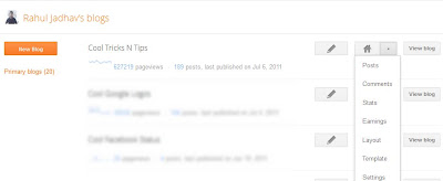
The design of the new blogger dashboard is better than the earlier dashboard and it is very smooth to use. The new blogger dashboard has a minimal design and there is an individual dashboard for every blogspot blog that you have created on Blogger. When you view the blogger dashboard, you will see a list of all the blogs that you have created along with stats like the number of pageviews for the blog, total number of posts and the date when the last post was published. There is a button for creating a new post, going to the blog dashboard and also a dropdown button to go to the different sections of your blog like posts, comments, stats etc.


New Blogger Dashboard Design by Google


When you move the mouse over the blog name, you will see a downward facing arrow. If you click on the arrow, the particular blog will be moved from Primary blogs list to another list named Other blogs. So this is a good feature as we sometimes create blogs for testing purposes and its better to add them to another list.

When you click on a blog, you can see the dashboard for that particular blog. I liked the new dashboard for individual blogs as it quickly shows information about the blog like its pageviews, the number of comments, traffic sources. Earlier there was a horizontal menu that contained the various sections of the blog. Now that menu has been replaced by a left sidebar.

New Blogger Dashboard Design by Google

Apart from the usual options, there is a new section called Earnings. When we tried to check it, we saw the Coming Soon message. We hope that they put together a great feature.

New Blogger Dashboard Design by Google


There have been huge changes in the blogger post editor. Now there is a simple box for typing the posts in the center and rest of the options are either on top of it or in the right sidebar.

New Blogger Dashboard Design by Google

Earlier, the post settings and other options like labels were at the bottom of the post. Now, these options have been shifted to the right sidebar and it looks beautiful. When you click on the Labels option, you can see all the labels that you have used on your blog. You can select any of them or create a new one. The other options are Schedule, Location and Options.

New Blogger Dashboard Design by Google


These are the new features in the new blogger dashboard. There are many other minor features which you can check by visiting Blogger In Draft instead of the normal Blogger page. We hope that the blogger team graduates this new blogger dashboard design very soon.
More aboutGoogle Redesigns Blogger Dashboard